Kitchen redo...have pictures


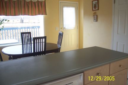
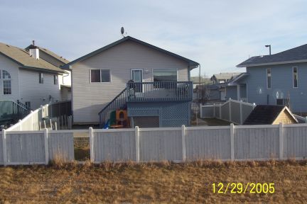
I also want to paint it red...similar to the Celestial Seasonings tea CHAI spice, the red pkging. Deep browny red. Right now we have it in yellow. I'd like to replace the back door and make a wall...I know requires new siding...then make french doors where the big window is....screen in the deck...it gets soooo hot in the summer, and with the field lots of mosquitos. 
Then the bathrooms need some updating...I want one jacuzzi tub, and tile the floors. Then the basment carpet needs to be ripped out...I hate the color. This house is about 10 years old, our appliance are all new (3-5 yrs old) except for the stove it was here...but still can't be older than this house. |
|
|
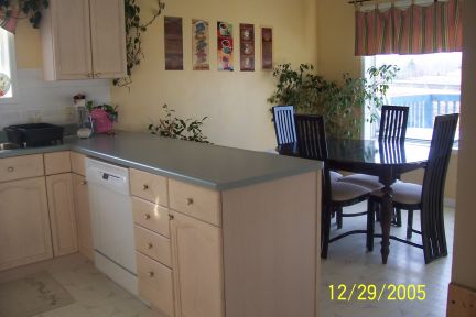
| Ok I got a good look. First the island needs to go. Needs to open up the room. that is very old looking, and from what I could see so are your lights. the window is a good place for a padio door. I wouls extend the kitchen with the dinning area and include you dinng set. makes for one big room with a exit to the deck. Don't have the measurement but maybe a island in the middle. Task lighting would be nice, something abouve you upper cabinets. Just some thoughts.
Ask Darcy too, we are both kitchen and bath designers |
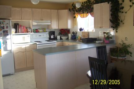
| I like the U-shape, everything is close by, and the long counter is great for cutting, rolling, sewing, etc...I use it all the time.
I want to make a new counter top with an overhang towards the dining room...so the kids can eat breakfast...or additional seating for entertaining.... I'd like to make the counter extend somehow to make a built in office area for our laptop, and filing...we don't have a nice place for a small office or bill area. As you can see I am not using my microwave area properly...we are so bad at piling up stuff on top of the microwave...I decided enough of that brought the cookbooks out, and put the microwave on the counter. So we lost some space...to prepare by the stove. But I don't have the same clutter problems, and it forces us to shred paper. I want to change the back splash...with new tiles, cool tiles. Your right the lights are old...this was a spec home. We are working on changing all the ights to energy efficent ones, with a brushed nickel finish. What kind of knobs should I do? Black to match the rods, ceiling fan...has both black and silver. Or brushed nickel to match the future lights. |
| got ya have to look again brb |
| Daisie, your kitchen is nice! I see what you mean about wanting to change it, but at least you have something nice to start from.
About the knobs--I would wait to see what color you paint the kitchen. And be prepared to have the kitchen be a cave if you paint it red. We have a red dining room and it looks like a cave. We also have a tiny bathroom with just enough room for the toilet and the sink across from it, and it was painted red and then last weekend I painted it a light blue color and it looks so much brighter and fresher, so think about what 'mood' you want your kitchen to have--bright and airy, warm and cozy, etc... I was thinking about the 'office' being along the big wall behind the table, but then I'd worry about the flow if you turned the window into a door--there'd be a lot more traffic going through... How fun! I love redos! Keep us updated! |
| Can you use a wall mount microwave over your stove? I have one, they come with 2 speed fans and lights, and save counter space, and then you don't need a hood. The problem with taking the island out would be threefold: you lose counter space, seating, and cabinets. How about having an open cupboard, you could use it for platters and bigger items and it would lend visual interest. Or a stained glass cupboard door would be great. You have a lot to work with, just needs some tweaking. I agree with the red, too dark. |
| Hi,
Boy if that's your old kitchen, my my older kitchen must be yucky! Still I know the thrill about getting things fixed up and It's so much fun to do it. Lots of work..but great excitement when it's all fresh and new. Good luck to all your upcoming renos and will be fun to see the before and after photos. Marianne and the boys |
| I love your kitchen just the way it is. LOL
I love ceramic os stone tiles too though.... and granite counters are so nice.... but still, I love your kitchen. LOL |
| So bright and CHEERY!!! Just Lovely!!!!!!!!! |
| Daisie,
One other thing I was thinking about...would you keep the existing cabinetry? That could also help determine the color scheme... |
| HAHAHAHAHA.....I read fast and thought this WAS the re-do!!!!!!!!!!!!!! It looks great now!!!!!!!!!! |
| Daisie your kitchen looks nice, bright and cheerful now....but it could use some updating...I agree with Deana....new lighting is a must, and if you are doing new cabinetry an island would be better than that pennisula...I also think that a space saver micro over the stove is a great idea and I loved mine in the old condo.....granite is expensive so before you jump into putting a new counter top on, you must really explore the idea of new cabinets....because once the new tops are on, it will be virtually impossible to put new cab's in....if you send me the dimensions of your room, I can draw a few things out to give you ideas......But I do agree with Stacey too, your kitchen is nice, clean and airy....
ps...love your kitchen table! |
| I feel like Marianne, wow, I'd love to have such a "modern" kitchen. My cabinets dark, falling apart, chewed on, etc. However, hubby see's nothing a little shoe polish won't solve.........ARGH!
The plumbing is held together with a prayer. Lighting a joke.......I have used clip on lights at times....... If I win the Lottery, I'm having the two designers here come redo my kitchen. Beware girls, I DON'T want granite.......I'm not a housekeeping slave to any item in the house. If it needs extra attention, it's not for me. |
| Mmmmmm, jacuzzi tub!!!! |
| Daisie, what about an apricot color for the kitchen? That woulg go nicely with the color of the current cabinets and it would warm things up, but not be dark like red would be... |
| Thanks everyone, it is nicely setup for us.
We would keep the existing cabinets...the rest of woodwork is the same color of wood. The railings, and bathroom cabinets. We picked Italian Walnut from Armstrong for our laminant...it matches the bleached look perfectly....the laminant is hallway, living room and master bedroom which all feed off the kitchen. We want a neutral floor tile to tie it all together. The laminant is okay to put in kitchen, high quality stuff, but I just don't know if we should. The amount of cupboards is perfect...lots of room. Plus we have a very large pantry. If I could manage the papers of bills and school stuff...the microwave shelf is just fine. Then I'd get the counter space back. I'd like a way to have a built in, in the corner of the cupboards and wall...a two level breakfast nook...perhaps with hidden filing cabinet....disguised as cupboards. Compact, just big enough for the laptop, and phone. And the paper shedder, and in/out paper holder. I was wondering what a island what look like? What would happen to dishwasher and pipes? I don't want to the color of knobs to match my wall color, since the wall color could change any given time. I am not tired of the yellow...but always loved the tuscun deeper looks of sunsets. I am in the process of framing those pictures, with black frames. I'd like the over all look to be a coffee/bistro feel...if I could brick a wall...with fake details for texture of old world charm I would. Our lights will most likely be pendant or something but will be flouresent. They will be brushed nickel, or nickel and black. The table is solid wood where I took the cherry base and added a black stain over top. Then because the dogs over time chewed the wood chairs, I replaced them with these used heavy iron chairs. I want bar stools to also be in black iron. With easy to clean seats. I can't go over the top with anything. But the counter top is my first priority. Then the back splash, and the floor needs to be replaced. The window and door would be last. I just don't like the back door so close to the stairs, but if it means millions to do something like that, then forget it. I can live with it. BUT if we ever replace windows...I will use that opportunity to do it then. The problem with spec homes is they are cheap looking and have no character. Esp when you visit these beautiful show homes, with attention to details...like a faucet. I can't believe I gush over a simple curved faucet...sure my taps give me water...but I like a little extra something. As well as under mount sink...love those too. Size approx...215 inches long and 130 inches wide...sorry can't find our reg tapemeasure...I belive about 12 ft long. Originally I wanted to get Formica countertops, called Butterum Granite, sparkle finish, # 7732-42 is my sample #. It matches the flooring (laminant), but it becomes alot of brown...I found it at IKEA. But i am sure everyone has the same samples. But if we can afford the real granite...I want to do that. But ask my husband he'll pick Formica...and save the rest for other things. |
barney1 wrote: Daisie, what about an apricot color for the kitchen? That woulg go nicely with the color of the current cabinets and it would warm things up, but not be dark like red would be...
Apricot...hmmm I like that color, I like the fruit too. I will keep that in mind thanks. Picture of the laminant: 
See how close the edge is to the door...we needed to replace the deck, and put in a stone patio, but when we went to put on new stairs, we didn't take into consderation the previous was a two level...and we lost the platform area that was there before....now it feels a little unsafe...but we are so use to it we may not change it. Howeve we still need to finsih off the deck...we just can agree on what to do with it...i want it open and he wants it closed in.  |
| I was thinking that if you took out the peninsula and then added an island, but also added on to the wall toward the window with maybe a taller, solid cabinet and then had it stick out to give you counter space over there, that might work (like a giant hutch). You could put the dishwasher to the right of the sink, and the island would give you counter space.
I was also thinking that if you filled in the door and added the french doors, you would have that indented space over by the doorway, where you could put in a built-in office. Also, with that wall (that is across from the cabinetry, if you removed the peninsula it would open up the room so you could put a hutch or something over there, too. |
| I like the idea of the hutch, and having the dishwasher by the sink.
There is a broom closet, as well as where I keep the dog stuff by the back door...but I suppose we could move that...this place has lots of closests. If that door wasn't there it is a perfect fit for the dog kennel. The pantry is directly across from the edge of the counter...about 3 1/2 ft between. I'd like a frosted glass door for the pantry too...open it up a little..it is solid like everything else. I love the idea of the new homes where you come home, enter through the garage into the walk-in pantry/mud room. Now that's being smart. |
| Kitchens, Decks, floors? hmmmmmm.......I'll have to look again. All I saw were the cutest dogs!
Did you have to take pictures that have such cute doggies in them? Oh, yeah, kitchens........hmmmm Brushed nickel knobs gets my vote! Clutter, yeah I hate, hate, hate it. I have a problem with mail piling up, no matter what kind of a system I try to create. |
Didn't find exactly what you're looking for? Search again here:

Custom Search
|
|
| |
|
|
|
|
|