Help me decide! Vote on my window trim painting!
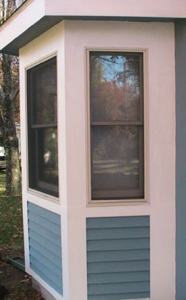
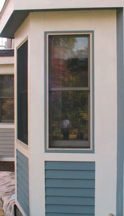
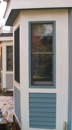
I have three pictures: One: Before (well sort of-- I had to use a similar pic), Two: With the outside trim painted, and Three: With both the outside trim and the screen border painted. Which looks best? Notes: Imagine, if you will, that the first two pics the trim will be ALL white, not white and cream colored. I currently believe that the window trim behind the screen will be white.   
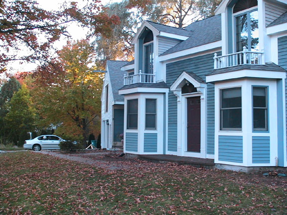
Here's a little wider view. Note that the closest window has already been painted as in pic 3 above: 
Remember, we're looking to add some interest! If you have another suggestion for the trim, please share! Also taking suggestions for how to paint the front balconies, railings and other trim work. I don't think we're ready to try to make this contemporary facade and turn it into a Victorian or Gingerbread, but we're all ears! |
|
|
| I like the third one. It looks very polished and very appropriate for your house.
I hadn't thought of gingerbread until you mentioned it but I do think that would be fun (when you're ready!). |
| I like the third one and LOVE your house |
| I also like the 3rd one. |
| The third one. It's beautiful. |
| I like the thin blue trim in your second photo; I think it adds a bit of visual interest! |
| I initially liked the second one too but then I started to think about how much of a pain that would probably be to tape/paint than the third. Then thinking about how much bolder the third is. |
Joahaeyo wrote: Then thinking about how much bolder the third is.
That is what I liked, more striking from a distance. |
| First of all, gorgeous house. Secondly, I like the third one....easier on the painter, too. |
| btw, my opinion does not correspond w/my vote. I didn't realize there were pics until after I voted |
Darth Snuggle wrote: I like the thin blue trim in your second photo; I think it adds a bit of visual interest!
ditto. |
| Definitely the all blue.
Your house is large, and the scale of the thin line does nothing when viewed with the whole house! It looks great, BTW! |
| Marty liked the third, I Liked number 2! |
| Initially I thought the thin blue border with the white screen trim would be the most interesting, but after looking at it I thought it might be too thin, and get lost in all that bright white.
So I painted the screen border an thought it looks a little more balanced. Currently, the window trim is a cream color and is kind of dirty, so the white will show up a lot more once painted. As far as ease of painting, all white would be easiest, the thin blue border would be pretty much a tie with the bold blue as the screens come out and require careful attention not to paint the mesh either way. Painting the screens as shown took mere minutes, and there are very few windows to worry about... the guy who built it was a little eccentric so on my first floor I have a total of 15 windows and just 4 plus the balcony windows/doors on the second floor. There are 6 skylights and 2 french patio doors. And 5 external steel entry doors. And 1 firedoor to the garage. And 1 to the loft. Eccentric. The house is a lot bigger than it looks; the balconies are in front of a full second floor so it makes the house look like a small 1 1/2 story while it is a full 2 stories. So it's almost 2700 sq feet before "the loft" over the garage which is about 700 sq ft. I think. Everythime it has been appraised or assessed, they come up with a different number. Eccentric. Keep the suggestions coming! How about little fans over the windows to match the ones over the balconies? (They match the color/texture of the barn door of the loft over the garage (not shown)) |
| I think we need to find you a few more sheepies for those windows! |
| My vote is for #3 |
| Victorian houses are nice though... One of the first two, evoking the bay areas and the balconies, perhaps?
http://users.rcn.com/scndempr/dave/school.html |
| Before the "renovation", the areas below the windows were panels, not clapboards like they are now. Claps were the fastest solution to getting it all put back together right away. |
| I just love your house.
I like the third design. happy Painting!! |
| I think you should have a darker trim color for the windows, it would help to balance out the blue and white .......maybe a darker shade of gray (with some blue in it) or perhaps a navy to compliment the nice front door and roof color teamed with picture #3 all one color darker color would give more visual impact........no fans on top too fussy edited to add paint the front door and fans in a darker color too |
| Definitely the 3rd one, it needs to be nice & bold. What you need for detail is potted plants maybe with big white flowers or splashes of bright colour on the balconies. Plants are not my thing, but I reckon flowery ones are in order |
little bear wrote: I think you should have a darker trim color for the windows, it would help to balance out the blue and white .......maybe a darker shade of gray (with some blue in it) or perhaps a navy to compliment the nice front door and roof color teamed with picture #3 all one color darker color would give more visual impact........no fans on top too fussy
edited to add paint the front door and fans in a darker color too I was thinking about this too - adding another color would be interesting and appropriate for the style of house. Although I would go with a red. |
| I liked number 2 but would also suggest a third color for interest. Your house is beautiful! |
| The exterior doors are currently a maroon color! Navy sounds interesting... buit I'm not sure Joan is on board with that. |
| can't you tie the maroon in with the windows some how? it would give some nice interest. |
| If only I could figure that out....!
Maroon instead of the blue around each window? I'm not sure that works. That's why I'm asking all of youse guyz, my decorating crew! Where else can you find interior decorators who really know how to add some punch to a living room? |
| Here is the frontal view... I just took this a little while ago, so it is too dark to tell colors.
Hey, how about 6 nice maroon window boxes? Or what colors might be better? How big would they be? And how about some flowers or sheepies painted on them? |
| I like the window box idea (and definitley sheepie cut outs). that and maybe going just a little darker with the blue trim..... |
| I like the 3rd one the best too.. and wow beautiful house!!! Where in Boston are you in? |
| Yeay! The window boxes with flowers and sheepies painted on them sounds lovely! |
london wrote: Where in Boston are you in? I am about 30 miles west of Boston along the Mass Turnpike, just west of Framingham in a little town called Southborough. |
| How long does it take to get to Niagara Falls from your house? |
| It's about 450 miles, so about 7 (if you don't stop) or 8 hours (if you crusie like me). |
| I liked 2 at first, but when I took a closer look at the other windows I changed my mind to 3. |
| So when do we get to see the finished project? No pressure or anything. |
| I like Picture 3 And I love your house!!!!!!!!!!!!!!! |
| pic one is boring...pic 2 looks like you wanted blue trim but had to settle with a white screen in it...pic 3 looks like you didnt settle...it will also bring the whole house together nicely |
| I chose #3. And think your home is gorgeous. I love the colors of the trees. |
Didn't find exactly what you're looking for? Search again here:

Custom Search
|
|
| |
|
|
|
|
|