
Okay, pick my tile
A) looks like artic? 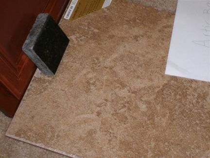
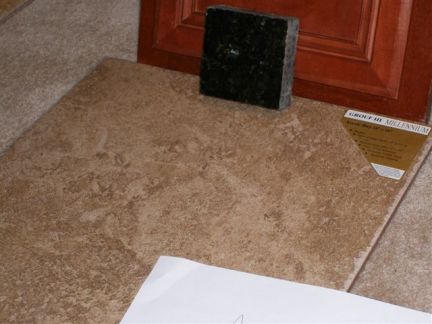
b) the darkest color - sonora 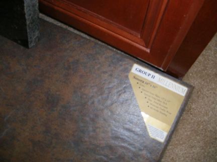
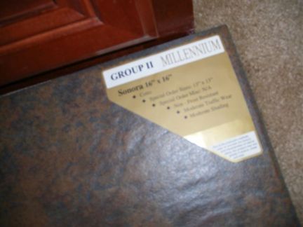
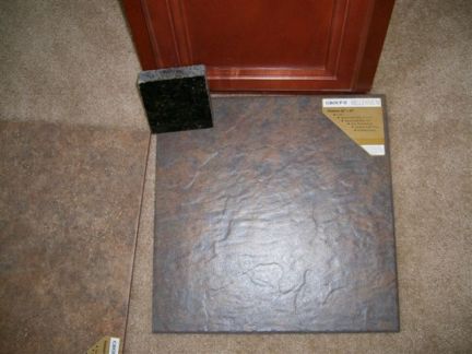
c) casila 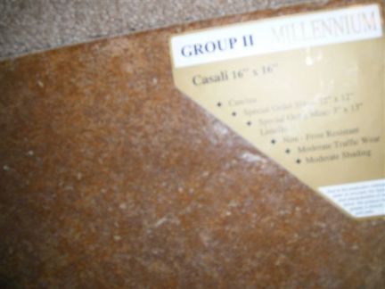
d) have no idea what the color reads but it looks like a different word from the rest. you can click on the camera to see larger. looks like it starts with an "s" but is not the sonora. 
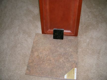
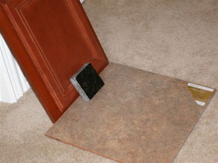
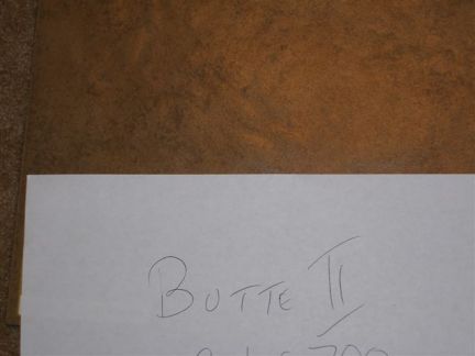
e) butte 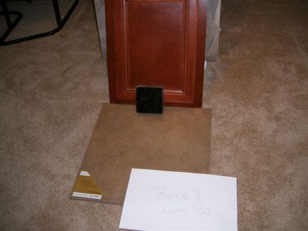
goes in here: 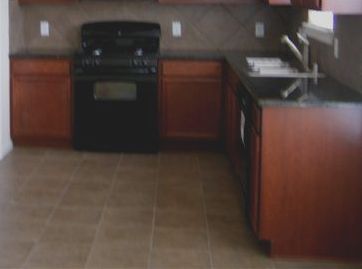
The realtor liked sonora the most. I think I like one of the lighter colors. I really don't know what I think... Think for me guys. thanks |
|
|
| I like the last color...not too light or dark. I think the lino in my bathroom is very similar. Has some grays, creams and rust in it. My vote is for number 3!!! |
| I added another one AFTER you replied just so you know... or I think I added it after you replied. I forgot to add it. |
| I still like number 3 with no name the best...and gray grout. |
| I want to say BUTTEII is what's already in the kitchen. At least I thought I saw it in the contract (for reference)
I should say this tile will also be in every other room as well minus bedrooms. Not sure if that helps with the decision but I have no clue how to pick ...with no experience with having tile. |
| That looks too gold, and the dark one is too dark...for my taste anyway. |
| I'm thinking the dark looks dark too. I don't know what it would look like down on the whole house though. I have no opinion on most of them.
P.S. It's also up against the color carpet we will have in the bedrooms. Actually the more I look at it... the more I do like the dark and pretty much all of them except for casilla |
| SONORA! |
| Numbers 3 looks best with the carpet. |
| I like the Butte also. I would try to stay in the middle between light and dark with floor colors. The dark or light are really hard to keep clean all of the time. They are pretty to look at, but take it from someone who used to have white floors...never again. With your busy family I would stay between the two colors. Another thing to think about. You will be living in a similar area that we do here in Florida. The way the newer homes are built alot of the living space "great room" or "gathering rooms" are in the middle of the house. They have a tendancy to stay kinda dark even though the builder do put in a lot of windows. I just wanted to bring that to your attention if you had not noticed that. As for the tile, go with a darker grout...saves you a lot of frustration in the future trying to bring the grout back to how beautiful it was when it was brand spank'n new.
Good luck with your choices. I remember my sister building a house and at the time I believe she told me there where 22 shades of white for her to choose from. lol |
| We also probably have an off white color baseboard.
Mr. J's picks are SONORA AND THE ONE W/NO NAME ...and third choice would be Artic. We do think Sonora may be a "little" too dark. It'll make the house look classier in some places and too dark in other areas. |
| Love the "no name " tile- I like a neutral color for tile
or carpet. Love this thread--thanks for letting us be interior designers for a day. (or maybe a few more days-- what other design or color questions do you have for us?? |
| IMHO dark is classier but to me it would depend on how much light there is |
| I love the Sonora one but I also like an overall darker look, too. Our kitchen has a similar color and you can't see ANY dirt on it. It's awesome! My second choice would be the Sumatra (I think that's what it says). It's dark without jumping in with both feet on the darkness wagon. |
| I love the sonora - I think you would be very happy with how nice it looks when set up. |
| I'm just going to throw in 2 more decisions. His sister says Artic or Butte. She's worried we'd have problems re-selling with the dark one.
I really thought this would be like the comforter where everyone would say the same thing. The realtor has been on my rear calling about deciding. It's driving me insane. I'm going to wait a little longer to get my husband's opinion once more (he is linked to this thread). I hope he reads this before she calls again. |
| I love SONORA...I'm not afraid of color and I like that it brings out the color of your cupboards. So if that's what you're looking for then go with sonora if you prefer not to emphasize your cupboards then go with more of the neutral one!
In other words ..both are gonna look nice! Good Luck ! |
| OH IT'S FOR SELLING ? oops.. then go with the neutral ...sorry for the last post |
| How long do you plan to live there? Even if you are thinking about selling, YOU have to live there first. I'd rather pick what I like and tear out later than sacrifice looking at something that I don't really like for years. |
| No, it's not.. we'll be staying there for awhile, but when we "DO" resell... houston has a million homes so it's hard to sell. Very hard. |
| BUTTE is my vote.... I think it's the most complementary to the cabinets and the counter and appliance colors. Go with dark grout and it will look amazing. But I still suggest you get Darcy's take on this, she is the expert....
Leslie |
| I love the sonora too... but if you're thinking resale and for a smaller kitchen I guess maybe go with the lightest. |
| Ughhhhhhhhhh... I could not decide, and I have the worst taste (when trusting myself). I think I wanted Artic or Butte after talking to my SIL. However, Mr. J wanted the darkest one then said he's not going to help me... I had to decide. Everyone had so many different opinions and I was hoping Darcy would weigh in but it looks like she was out all day. I decided to go purely off majority, so Sonora it is. It's not my favorite for the reasons stated already, but my realtor thinks I'd be very pleased once it is laid down. She's a pretty experienced decorator herself, so... I guess I should trust her. Thanks everyone. |
| I like Sonora best too - and I think you're perfectly safe with it for resale purposes. It's still neutral and there is plenty of light so it's not going to make your space look too small. Plus I think people are generally getting away from lighter colors and going with slightly darker in general. The show homes here have a lot of dark colors these days. |
| My choice is the S (which may be Summatra) or Arctic.
Mystery S has some interesting colors in it. Arctic is safe. Sonora is beautiful but it would tend to keep you in the "blues" for home design. Butte is also interesting and with a darker grout would be nice. I agree, Casila stinks.......too gold. |
SheepieBoss wrote: Sonora is beautiful but it would tend to keep you in the "blues" for home design.
I think browns, golds, reds/russets, greys - all of those will work with it. Even the right greens. |
| My biggest concern was what Sheepieboss said. We'll see how it goes. Not like we have a choice anymore. |
rdf wrote: SheepieBoss wrote: Sonora is beautiful but it would tend to keep you in the "blues" for home design. I think browns, golds, reds/russets, greys - all of those will work with it. Even the right greens. I thought what apparently is blue was green. I don't like it as much anymore if that's blue. |
| I like the one you can't read, which looks like "summatra" to me.
It will go with most any color walls or design theme. If you get one too dark, every light colored hairball and linty shows up. Plus, if it is going everywhere, a dark color will draw the eye and dominate. |
ButtersStotch wrote: rdf wrote: SheepieBoss wrote: Sonora is beautiful but it would tend to keep you in the "blues" for home design. I think browns, golds, reds/russets, greys - all of those will work with it. Even the right greens. I thought what apparently is blue was green. I don't like it as much anymore if that's blue. To me it's really more of a slate gray. Blue/green undertones. |
| Me too Dawn...that one has gray,tan, and a rosey cream color...and it looks very nice with the carpet |
| After looking at the inside house pics again, I think lighter would have been better. Not sure why I didn't have the pics up and just looked at all my kitchen ones. BUT, I do believe anything would work if you work around it (repaint walls, etc). Thankfully the only animals that shed in the house are black, and we never notice their hair (except on bedspread). We have 0 furniture except for the bedroom which is rich like the cabinets, so we can buy things that would compliment and brighten up. No turning back now! |
| Well, it's been delayed because the upstairs tile is something else... and we thought there was tile on the fireplace (that was butte II). Turns out, there is no tile on the fireplace because it's cast iron.. but it still gives me time possibly change my pick. We're waiting on pricing as my second pick is a higher grade tile. Mr. J isn't here and is driving back from Fairbanks now, so he can't weigh in. |
| Go with the no name tile...not too light, not too dark. Can you tell I love that one? |
I went with Summatra (no namer) because it was an upgrade in tile and after reading about grades... it's preferred for heavy traffic places (3) such as the kitchen and living areas! It's not costing us any more AND they're giving us a $500 gift certificate to lowes because I complained (no surprise) that we wouldn't be able to participate in their energy promotion b/c I didn't like their energy company.  I feel a lot more confident now! I feel a lot more confident now! |
| You go girl...it's beautiful. You are the buyer...it is definately your market. You should be able to ask for the moon right now. Just push them as far as you can. If you walked away, they would have an unsold house
Can't wait to see you all in and enjoying your new home!!!!! |
| okay....heres a question for you before i vote..
what colors are in your furniture/what you like....do you like neutral grey undertones or richer gold/taupe undertones????? |
| We don't have furniture. We generally like rich colors, dark (espresso), rustic, and neutral colors (sage, beige, rich wine). However, I have no idea what we plan on doing to this house. I missed you yesterday Darcy!!! It's too late now. I put in my final request. I can only pray it looks nice. |
Didn't find exactly what you're looking for? Search again here:

Custom Search
|
|
| |
|
|
|
|
|